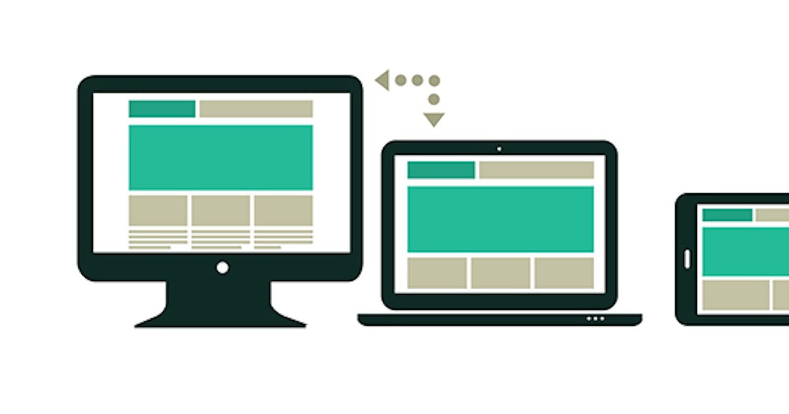

Hello Everyone! we will look at this article on how to use media query. Media query is a CSS technique introduced in CSS3. It uses the @media rule to include a block of CSS properties only if a certain condition is true.
I'm using Bootstrap for my project to build a responsive layout where I want to adjust a few font sizes according to the screen size. A few ways to use these.
Here are the selectors used in B-3, if you want to stay consistent:
@media(max-width:767px){}
@media(min-width:768px){}
@media(min-width:992px){}
@media(min-width:1200px){}
Note: For Your Information, this may be useful for debugging:
<span class="show-xs">SIZE XS</span>
<span class="show-sm">SIZE SM</span>
<span class="show-md">SIZE MD</span>
<span class="show-lg">SIZE LG</span>
Bootstrap 4
Here are the selectors used in BS4. There is no "lowest" setting in BS4 because "extra small" is the default. I.e. you would first code the XS size and then have these media overrides afterward.
@media(min-width:576px){}
@media(min-width:768px){}
@media(min-width:992px){}
@media(min-width:1200px){}
Bootstrap 5
@media(min-width:576px){}
@media(min-width:768px){}
@media(min-width:992px){}
@media(min-width:1200px){}
@media(min-width:1400px){}